Product Configuration Tool
Galileo’s Product Configuration Tool was to be a brand new platform that would replace an older tool that was used for creating and updating our partners’ debit card programs and products. This was an internal facing tool intended for use by Galileo employees only.
My Role
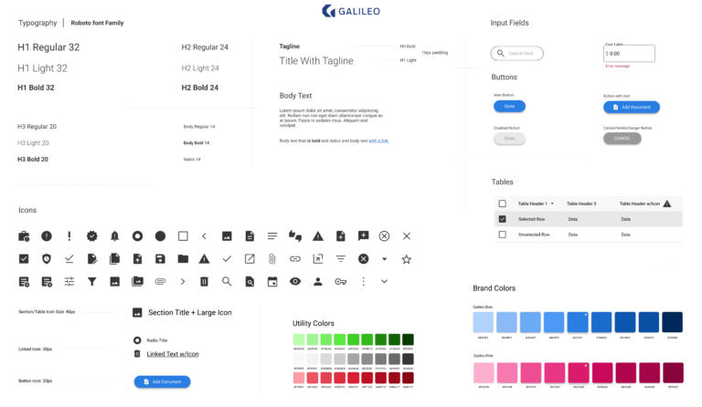
As the sole designer on this project I was tasked with designing the UX and UI, while also incorporating an updated company logo and brand style.
The Opportunities / Challenges
- Create an all new tool from the ground up.
- Reduce the time and steps it takes to make changes to card programs.
- Reduce the amount of errors and external communication channels.
- Reduce the amount of manual communication that was needed.
I started off by sitting down with the engineers at Galileo and asked them a lot of questions while observing how they used the current tool, paying close attention to pain points and the process flow. Being able to speak with them gave me great insights into the processes they worked through and I could quickly see that one of the biggest pains for them was confusing information architecture.
Additionally they were having to jump between several different apps to review the change request ticket, review the proposed changes, make the changes and request a review of the changes.
Personas
Galileo Admin
Background: Work at Galileo providing minor account level support for other users and needs unrestricted access. Their changes still need to be validated by peers.
Goals: Create and manage user accounts.
Galileo Engineer
Background: Work at Galileo and provide support to clients that have submitted ticket requests through their Account Managers. Slightly restricted access to not be able to manage accounts and required to validate their changes through QA process with peers.
Goals: Track ticket requests and provide client support by making requested changes quickly and accurately without having to memorize obscure program options.
During my interviews with the engineers I discovered there was a lot of information to each card Program and Product and over the course of my earliest interviews I focused on understanding the information hierarchy. Once I had a solid understanding I began working on the how to group them and also how to efficiently navigate between all the levels with their multiple sub-levels.
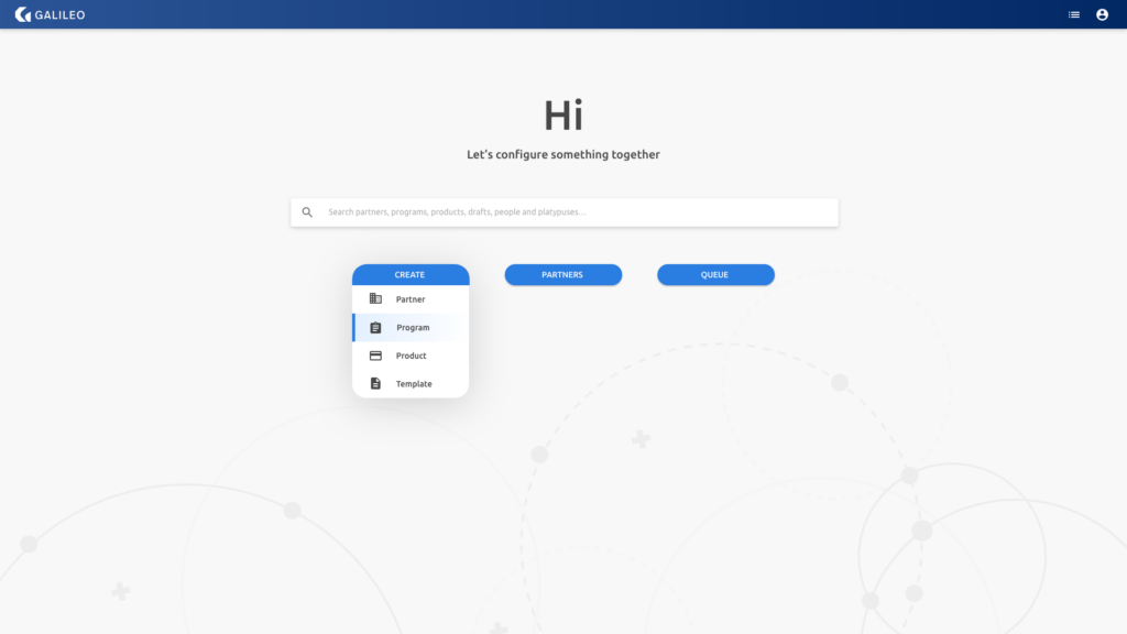
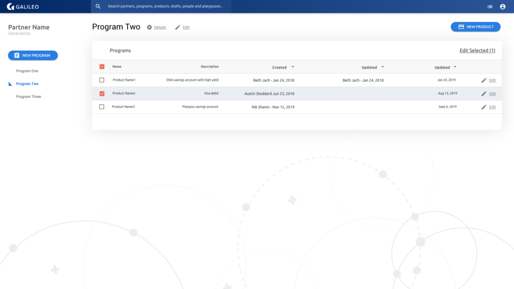
Here is the basic hierarchy that you’ll see in my designs below: each can have multiple Programs and each of their Programs can have multiple Products.
- Partner I
- Program Alpha
- Product Alpha1
- Product Alpha2
- Program Beta
- Product Beta1
- Product Beta2
- Program Alpha
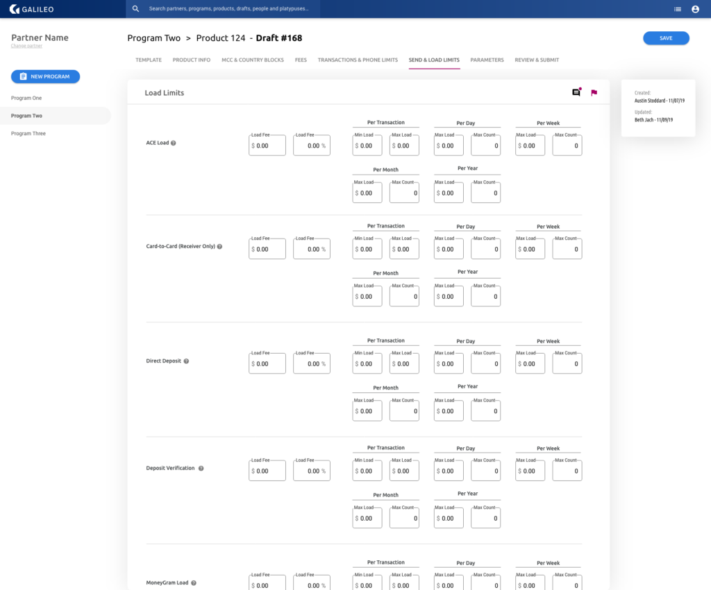
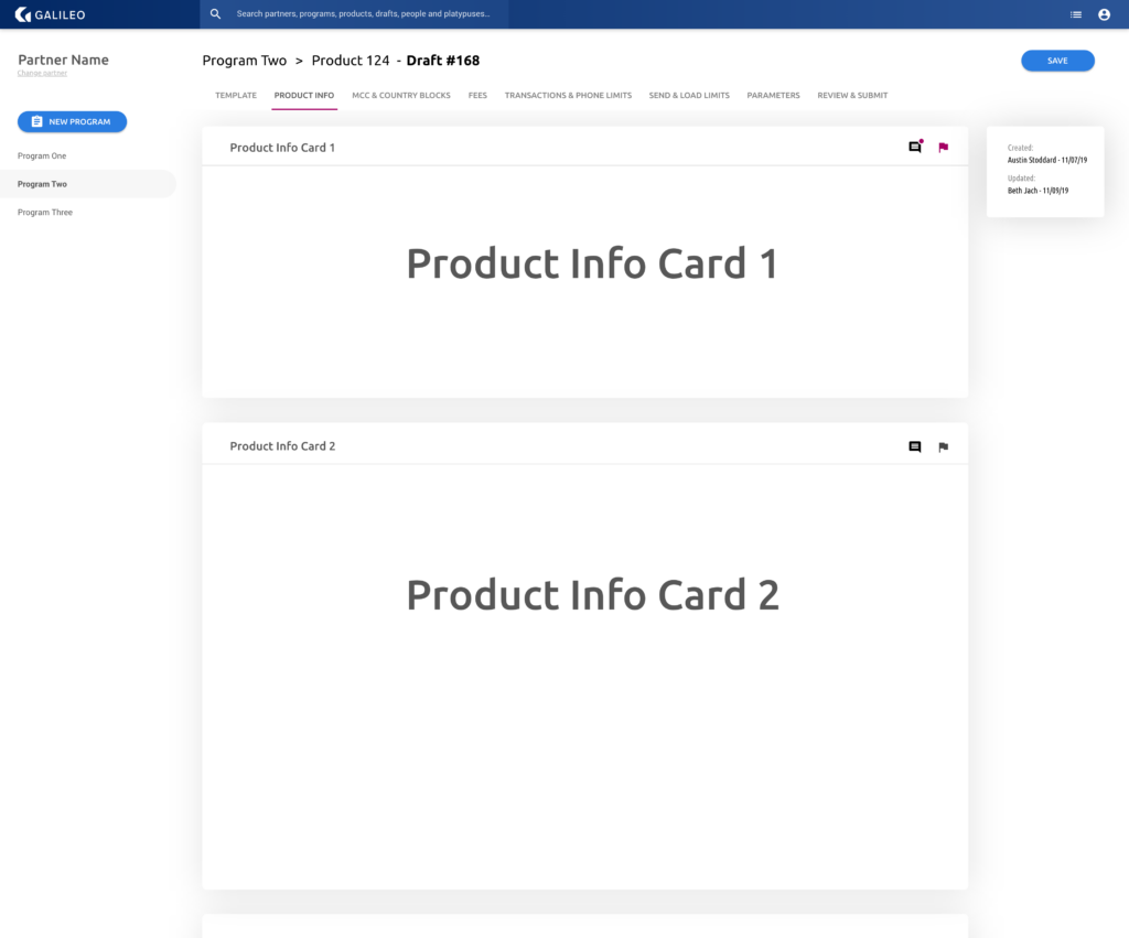
I spent a great deal of time testing the navigation’s usability with wireframe prototypes that I would regularly put in front of the engineering team members. In the end the layout that I found worked best for the engineers’ flow was one where the main navigation was on the left, containing the two top levels of the hierarchy: Partners and their Programs.
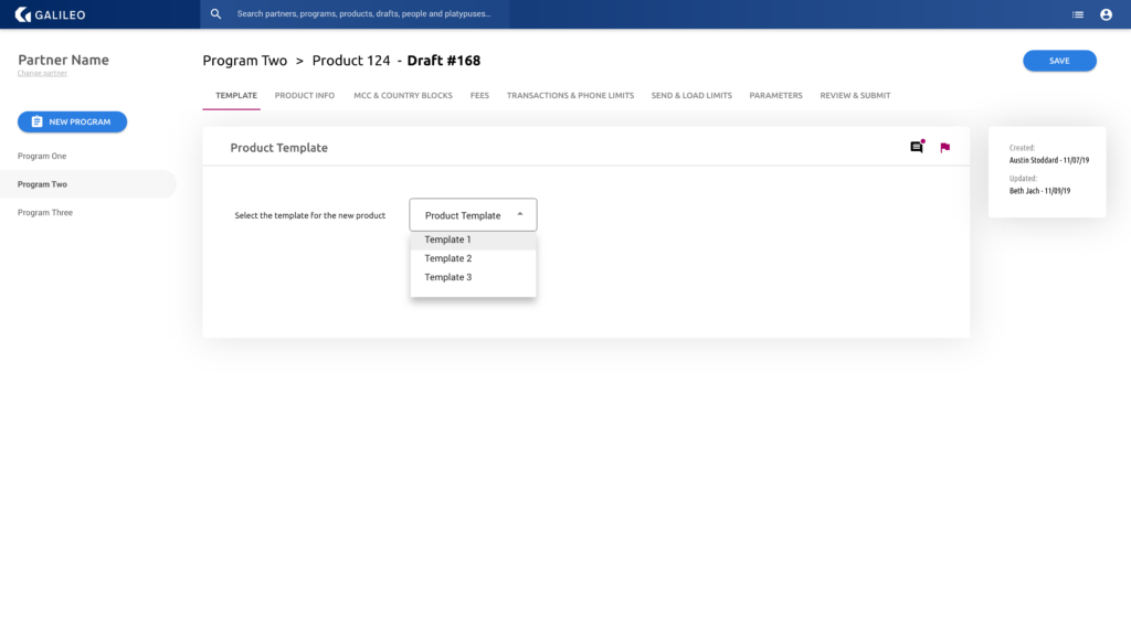
Then once the user dove into the Product level I used tabs across the horizontal screen space as this was the level that contained the most amount of details, all grouped together under their respective tabs.
Once the user selected a tab within a Product I utilized card groupings in order to help them find what they’re looking for quickly. There were multiple screens worth of card groupings to each tab, so I laid the cards out vertically, allowing the user to scroll up and down to find the parameter group they’re looking for.
The communication to their teammates about feedback and the status of changes made by other engineers was previously a manual and tedious process, but it was critical to ensuring quality control. By including the Information Panel on the right side of the screen, engineers would no longer have to use spreadsheets and emails to know who had created/edited/approved changes.
Noticing that the engineers would have to scroll down a lot to find the parameter grouping they needed, I added a Table of Contents to the right of the main view, which would jump them down to the section they needed with only one click.
With so many parameters possible in each Product, it was hard for the engineers to remember what every parameter was used for, so to help ease their cognitive load and to reduce possible errors I included tool tips for each parameter group.
In the end
Organizing all of the information possible in this app was such a challenge, I explored countless possibilities and did an intense amount of wireframe revisions and secondary research in order to find the best solutions but I loved every minute of it. I learned a lot about information architecture and found some solutions that made the users truly excited to use the new app.
