Disputes Tool
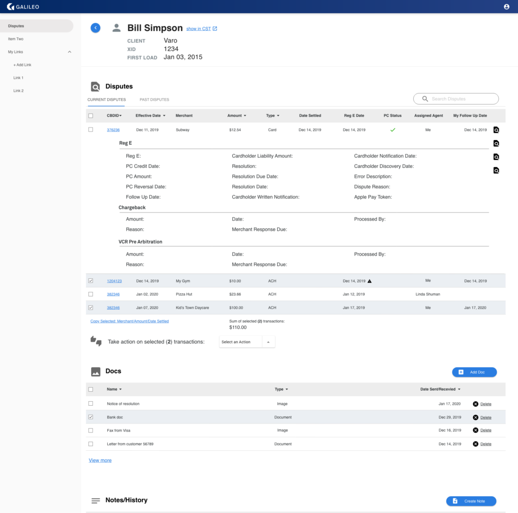
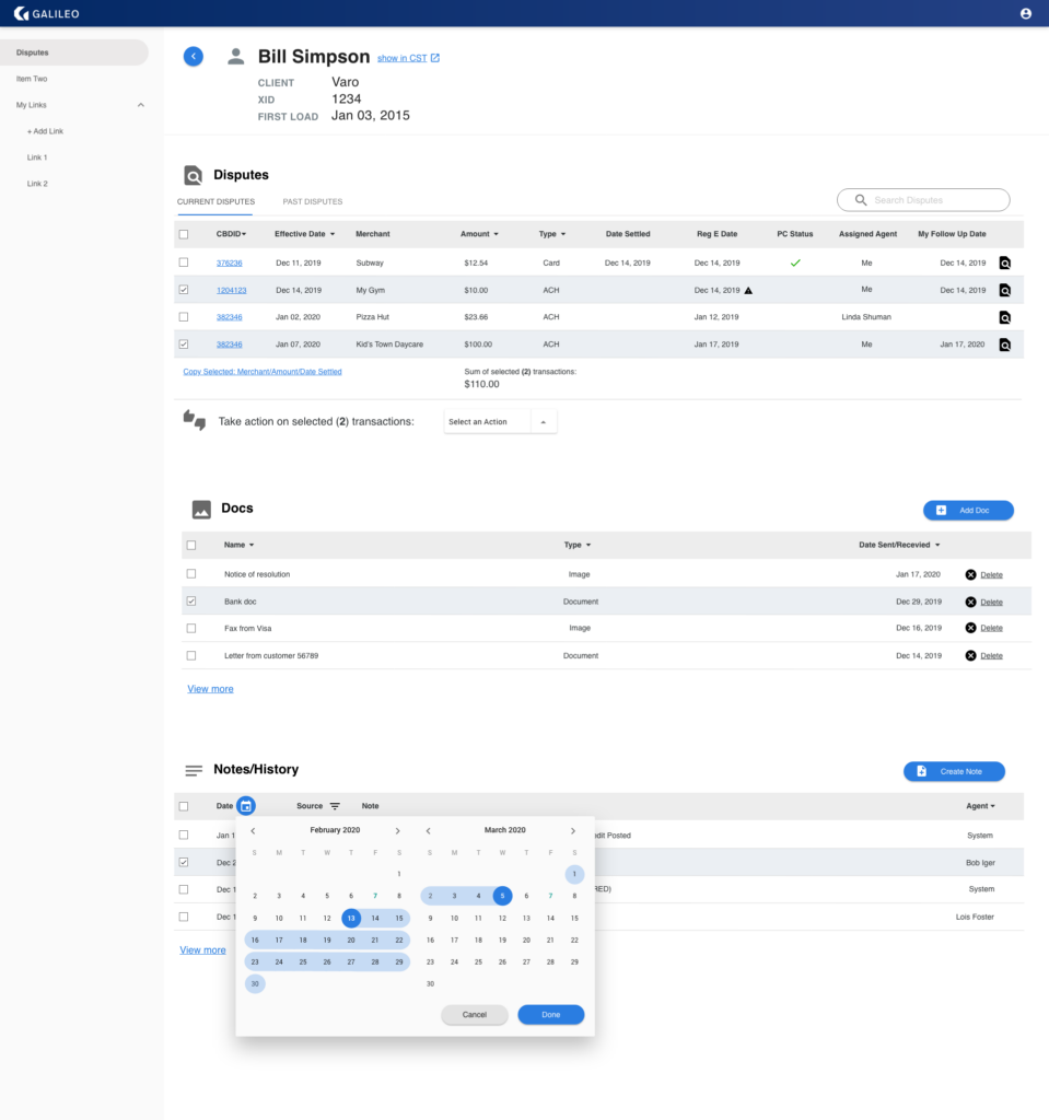
This was a completely new tool that internal customer service representatives would use in the processing of cardholder disputes for charges on their debit cards. It was to be built to include a large amount of information from different sources and needed to follow strict government regulations for Electronic Funds Transfers (Reg E).
My Role
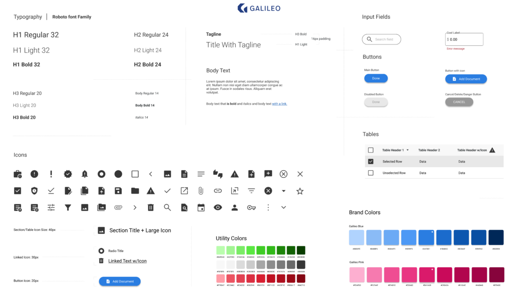
Tasked with building the new UX and UI from the ground up while incorporating a new company logo and also helping define our new brand standards in the process.
The Opportunities/Challenges
- Direct access to users
- Complying with Government regulations
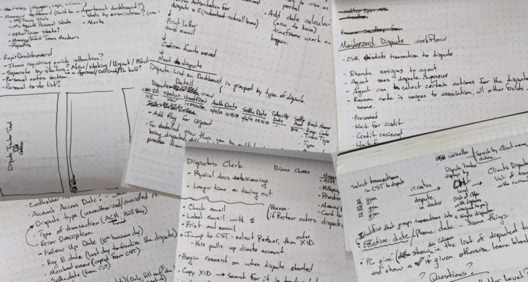
Not knowing anything about debit card disputes I began my research by first interviewing the disputes team lead and then individual agents while also observing each of them as they worked. As I observed their workflow of spreadsheets, letters, notes on physical paper, personal calendar reminders and more, it quickly became clear that one of the first opportunities with designing this tool was to reduce errors.
Personas
Galileo Team Lead
Background: Work at Galileo managing a team of disputes agents and used to be an agent themselves.
Goals: Manage and assign customer disputes tickets to agents on their team. Support team members.
Galileo Research Agent
Background: Work at Galileo entering in new disputes related paperwork and resources for eisputes agents to use.
Goals: Quickly and accurately add supporting documents and information to the existing dispute ticket.
Galileo Disputes Agent
Background: Work at Galileo providing support researching and resolving customer disputes for various clients.
Goals: Research and resolve debit card disputes quickly and accurately while following the governments regulations.
During my interviews I learned that most errors happened because each agent had their own system for tracking tasks and follow-up reminders and that these were all manual processes that required a very high cognitive load from having to remember so much.
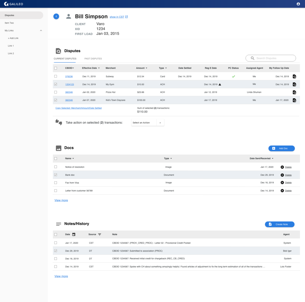
By focusing my efforts on consolidating the sources of information and creating tools directly in the new interface, I was hopeful their department could be more efficient and successful.
Some external sources of information that I combined into the new tool included:
- Scanned documents
- Customer services notes
- Personal Reg E date calculators and reminders
- Personal task lists
- Personal bookmarks
After conducting several rounds of interviews and observations I began by using my notes to build out process flows and wireframes, breaking down each task into individual steps.
Through my observations I noticed that some processes didn’t make perfect sense to me but they did to the agents working them, so while I was building the wireframes I started making them into prototypes far earlier than I normally would have. I did this so that I didn’t need to rely on my own biased assumptions in order to get the design right.
Putting these early prototypes in front of the agents so soon helped me find the right layout for the agents and saved me from having to do more revisions.
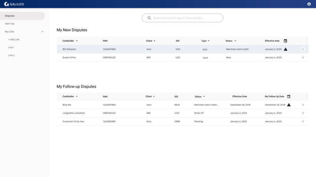
After refining the wireframe prototype to a good enough point where I wasn’t going to need to make any drastic changes I began rendering the elements with shape, color and more detail.
The amount of information the agents needed to be able to access was staggering. while watching them work I could see that they didn’t always need to see all of the information at first, there were less valuable groupings of information that were rarely needed.
By providing the high value information first and then lazy-loading the next layer of information after a click, we could keep both the agents and the application from being overwhelmed.
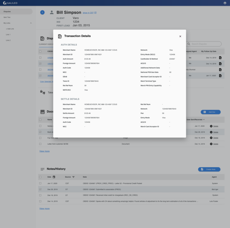
With screen space being at a premium on the agents’ tiny workstation screens there were some groups of information that, through usability testing, I found were best displayed in a modal.
In the end
Standardizing the workflow and countless usability tests were what made this project successful, all the days I spent with the agents was such a critical part to the success and also where I found the most satisfaction on this project. There’s nothing better than seeing the joy on someone’s face when you’ve designed something that makes their job more enjoyable.
